Are you wondering what colors to use in you next rock paintings? In this blog, we’ll show you what you should consider when choosing the best colors and color combinations to create beautiful and impactful rock art.
Basic knowledge of color theory is essential when choosing colors for rock art. Familiarity with the color wheel, color schemes, and color properties enables artists to use colors that work well together, resulting in more visually appealing and cohesive artwork.

~This post contains affiliate links.
What Colors to Use for Rock Painting?
When it comes to choosing colors for painting rocks, knowing the basics of color theory will come in handy. Here are a few reasons why:
- By understanding aspects of colors, the artists can use colors that look great together and make their artwork more visually appealing.
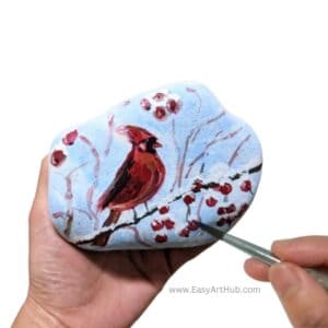
- Colors can also convey emotions and messages, like how red can represent love(which I try to convey in the Gemstone Rock Art above) or passion, and blue can represent sadness or calmness.
- Colors can draw attention to specific parts of the artwork. By using brighter or contrasting colors, artists can highlight important details and messages.
- It helps the artist understand how the natural color of the paint surface may affect the final look of the paint.
Whether you’re looking to create art to spread a message of kindness or for whatever fun purposes, this guide will help you make rock arts you will be proud of.
In the next section, we will dive deep into each aspect of color theory and how you can utilize them in your rock or stone paintings.
Basic Color Theory
Color theory is the study of how colors work together and how they can be combined to create different effects. Understanding how different colors interact with each other can help you create compositions that are visually stunning and emotionally evocative. This is true for any painting surface, more so with rocks.
Also by knowing color theory, you will need much fewer paint colors(only red, blue, yellow, white, and black) in your stash.
Color Wheel
The color wheel is an important element of color theory. It is a visual representation of the relationships between different colors. It consists of twelve colors systematically arranged in a circle.
The 3 primary colors (red, blue, and yellow) spaced evenly around the wheel serve as the base of all the other colors.
The 3 secondary colors (green, orange, and purple), are then created by mixing two primary colors together. And finally, 6 tertiary colors, are made by mixing a primary color with a neighboring secondary color.

A color wheel guide can come in handy. If you’d like to practice mixing your own color wheel palette, you’re in luck. I included a simple tutorial in my blog Mixing and Blending Acrylic Paint.
Color Schemes
In acrylic painting, color scheme refers to the selection and arrangement of colors used in a painting. Like in interior decoration- you want the colors in a room to complement each other and create a harmonious overall look.
While there are lots of color schemes, here are the ones that can easily be applied in rock paintings:
Complementary colors
Complementary colors are located opposite each other on the color wheel, such as red and green, blue and orange, or yellow and purple. When used together in rock art, they create a strong contrast and can make each other appear more vibrant.
Note:
*Neutralization happens when two complementary colors are mixed together. This results in a dark neutral color like dark brown or gray. Colors can also be neutral by adding black/gray.
In the example below, mixing red & green(complementary) creates brown.

Monochromatic colors
This color scheme uses different shades and tints of a single color(which we will discuss more later in ‘color properties’). It creates a sense of unity and simplicity and can be very calming, often used as a background in ‘kindness rocks’ or rock art with written messages.
Triadic
This color scheme uses three colors that are evenly spaced on the color wheel (e.g. red, yellow, and blue). It creates a sense of vibrancy and playfulness, great for abstract or whimsical rock art.
Analogous colors
These colors are located next to each other on the color wheel, such as blue, blue-green, and green. For example, you could use yellow, orange, and red to create a warm and harmonious piece.
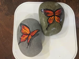
In the Butterfly Rock Art below, I used analogous colors (red, red-orange, orange, yellow-orange, and yellow) as the base of the wings. This makes it look cohesive, which also adds to the realism.

Properties of Colors
Color properties should also be considered when choosing your colors. While there are lots, here are a few that you need to be aware of:
Values
The lightness or darkness of a color is referred to as value. It’s what makes a blue sky appear light and a shadow appear dark. It is an essential element in creating contrast and depth, giving an artwork or design a sense of dimension and realism.
Tints and shades are two ways of adjusting the value of a color. Tint is created by adding white to a color, making it lighter and brighter. For example, adding white to blue creates a light blue that’s perfect for creating a sky in a springtime landscape.
On the other hand, a shade is created by adding black to a color, making it darker and more muted. Adding black to blue creates a dark, moody blue that’s perfect for creating a night sky or a stormy seascape.
In the very first picture on this blog (Gemstone Rock Art), I used shades and tints for the heart to create a realistic look.
Saturation
Saturation refers to the intensity or purity of a color, and how vivid or dull it appears on the canvas. It is determined by the amount of pigment in a color and can range from highly saturated (vibrant and eye-catching) to desaturated (subdued and muted).
Saturation and value work together to create contrast and depth in a painting. By manipulating both elements, an artist can create a wide range of effects and moods in their rock art. For example, a highly saturated color against a desaturated background can create a sense of vibrancy and energy, while a range of values in a grayscale painting can create a sense of depth and dimension.
Opacity
Paint opacity refers to how opaque or transparent a paint color appears on the canvas. A paint color with high opacity is more opaque and will completely cover up any colors beneath it, while a color with low opacity will allow the colors beneath it to show through.
Opacity can be adjusted by either adding gel/glaze, black/white paint, or thinner/water.
Adjusting the opacity can affect the value and saturation of the color.
Warm vs Cool colors
It might sound weird, but colors have ‘temperatures’, and you should consider them when choosing your colors.
For example, a rock with a message of love and kindness could use warm, bright colors like red, pink, and yellow to evoke feelings of happiness and joy. On the other hand, a rock with a message of tranquility or relaxation might use cooler colors like blue, green, and purple to create a calming effect.
Ultimately, adjusting color value, saturation, opacity and temperature is a personal choice and depends on the effect you want to achieve in your artwork.
Play with different aspects and find the one that works best for the piece you want to create.
Rock Your Colors: More Tips for Stunning Rock Art
As a bonus, I added extra tips that will help you take rock art to the next level.

1. Try Different Techniques
Don’t be afraid to experiment with different paintbrushes or tools to create interesting effects. Sponges, toothbrushes, or even Q-tips can be used to create texture or add a unique look to your design.
Experiment, this is exactly what I did with the rocks pictured above. These and the basics are explained in my blog Mixing and Blending Acrylic Paint.
2. Play with Patterns
Adding patterns to your rock designs can create interest and depth. Stripes, dots, or other simple patterns can give your rock a unique look and add texture to the design. You can also experiment with using stencils or stamps to create intricate patterns.
3. Keep it Simple
When it comes to kindness rocks, sometimes less is more. A clean, simple design can be just as impactful as a more elaborate one. Consider using just one or two colors to keep the design minimal and powerful.
4. Choose the Right Rock
Choosing the right rock is key to creating a successful kindness rock design. Look for smooth, flat rocks that are free of cracks or blemishes. You may also want to consider the color of the rock, depending on the paint color you have in mind.
5. Apply Color Theory when Choosing Primer
Choosing the right color of primer will make painting the rock faster. For example, if you plan to have a pink gradient background, you can use white primer and blend in a bit of red to create that effect.
5. Get Creative with Lettering
The message on your kindness rock is just as important as the design itself. Consider using different fonts or lettering styles to make the message stand out. You can also experiment with using different colors or adding shadows or outlines to create a three-dimensional look.
We hope you found all this knowledge helpful and inspiring. Now that you know about color theory and how to best utilize it for rock painting, you’ll be able to create beautiful and unique rock art that truly captures the essence of your vision. Keep on rockin’!